Date: 2017-2019. Role: Product Designer.
There are three projects for biggest bank in Central and Eastern Europe, it’s Sberbank. Mobile workplaces for work «in the field» and remote business registration for iOS and Android. It’s hard to explain all process, because it was not linear. You know, iterates (research, prototype, test, learn some stuff, researched some more, prototyped again, tested again, learned more…).
ID Point Android
Before you will download the application, you need to go through all steps of the business case. And web promo.
![]()
🏆 Awards: Global Finance names the Most Innovative Banks and Fintech Companies by Region as part of the Innovatorsa at 2020. In Central & Eastern Europe it’s Sberbank. One of the ten achievement was this product «ID Point», it gives an opportunity of remote opening of an individual entrepreneur account and it improved UX of clients a lot. You can find out more.
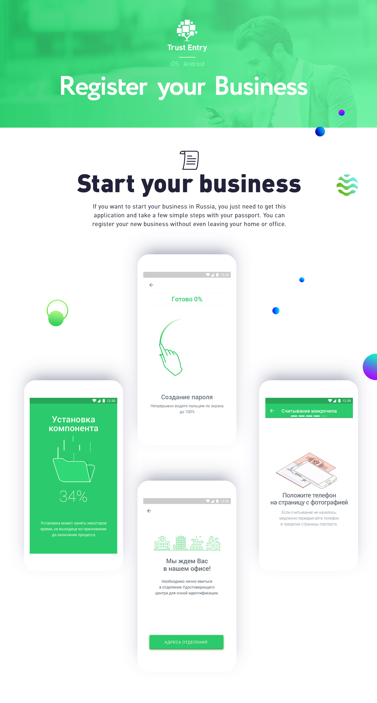
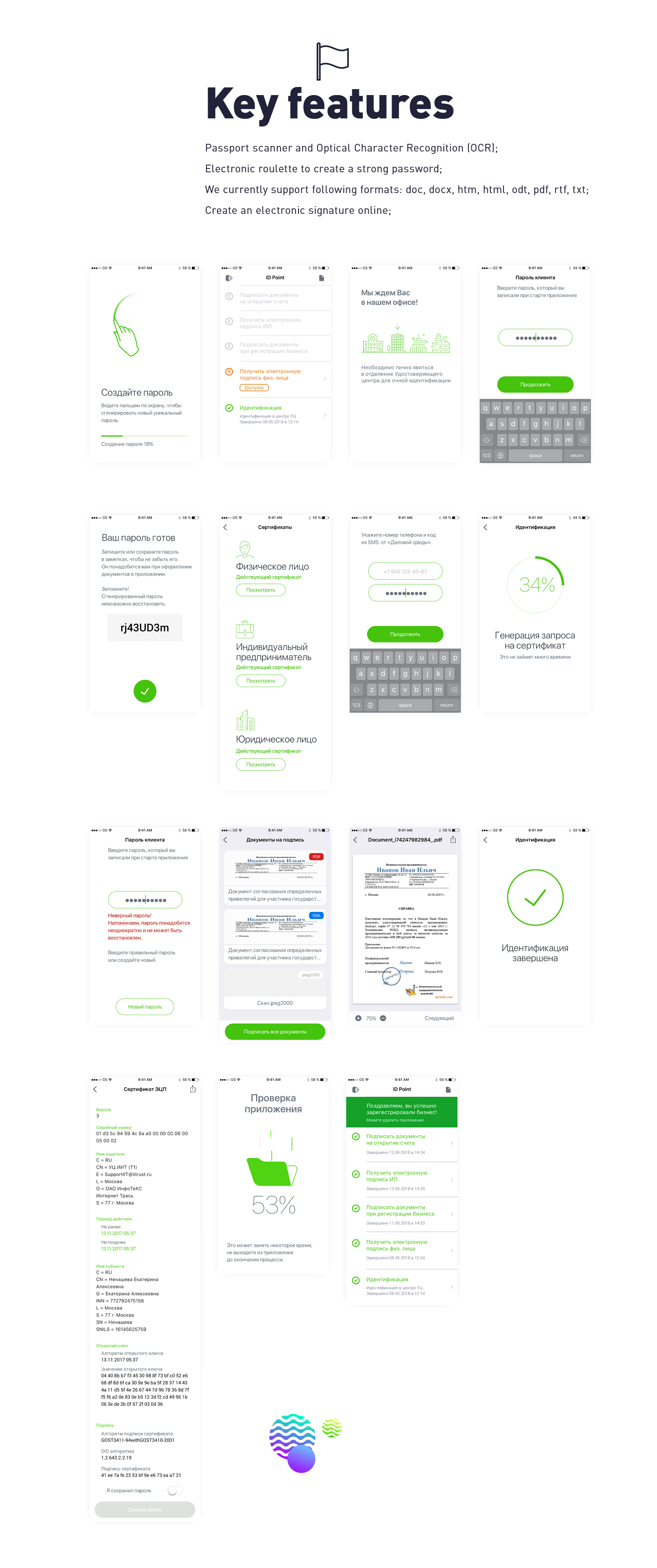
You just put your smartphone to your identification documents and the mobile app registers you as a businessman. Of course, it is a unique product without analogues, you could not see the solutions. And we conducted many design-thinking sessions, research, interviews, usability tests to gather all the information needed to create final design.
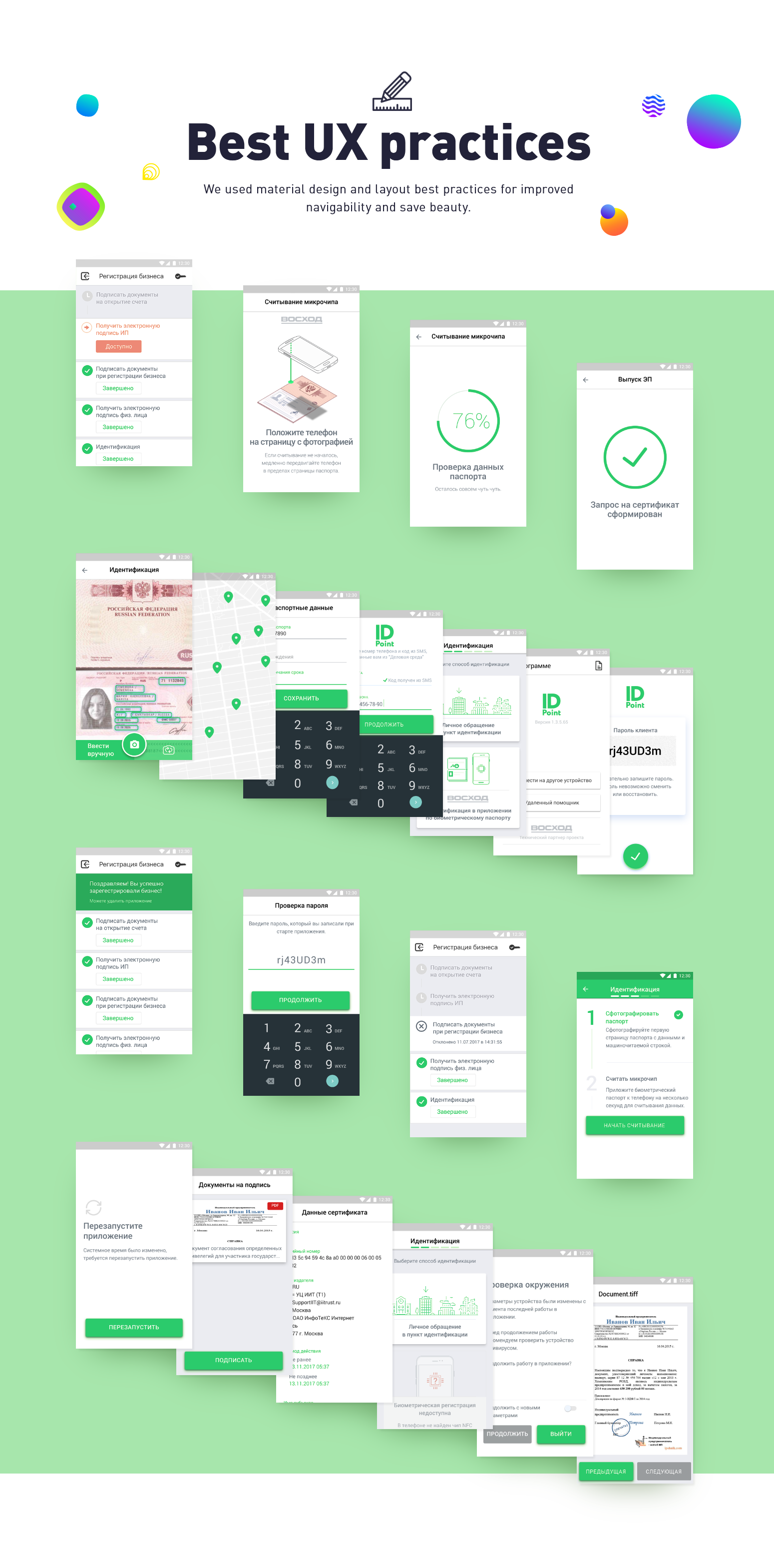
Only animation can explain, how to use NFC with Russian foreign passport. We did a lot of animations to teach our customers and checked all hypotheses on UX-tests.
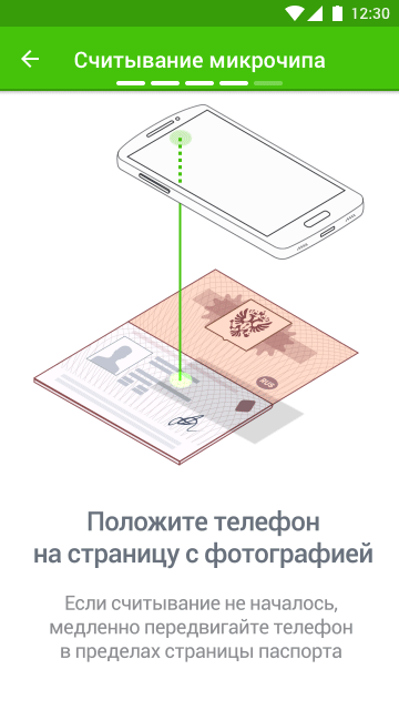
In fact, different phones have an NFC-reader in different parts of a device, and it’s difficult to make absolutely precise instruction on how you need to place your phone on the passport page. And even more, in the passport, we have only one of four different chips, and not all types of NFC-readers can read all types of chips. I created a special video to explain to our customers the correct sequence of actions.
ID Point iOS
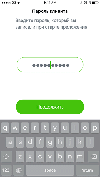
You know, what the difference between Simplicity and Minimalism? In minimalism, you can draw a lot of mockups, but they will be felt like one screen. I tried to use this rule for Android version of Design and has interpreted all cases through few visual components. As result, all cases looks like similar and use common user experience. But on the backend side, it’s absolutely different cases.
I was always worried about the future of my project, because I’m a product designer, not just a designer. In the world of mobile development, I can give developers only mock-ups and requirement, it’s not enough. So, I controlled iOS developers during the whole process to get an excellent result. As a result, the implementation gets any changes, but all these changes provide a better experience for our users than it can be in accordance with the first prototype.Open as full-screen this roadmap
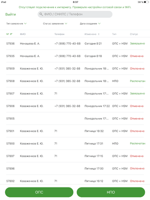
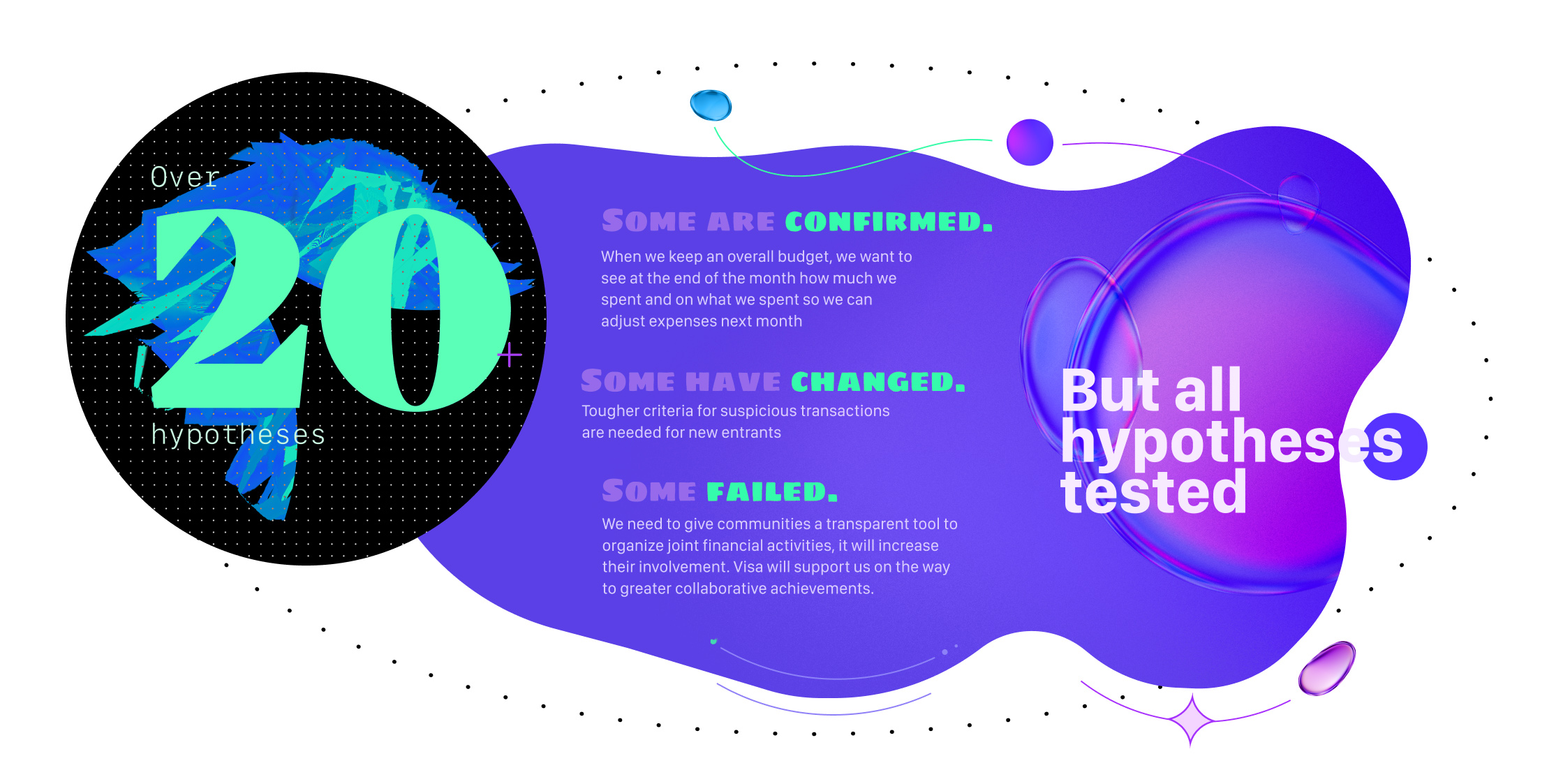
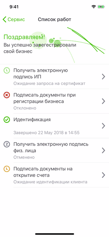
We analyzed all user sessions, understood what stages cause users the greatest difficulties. A sales funnel is used to view the entire process of processing the application and retrieving documents. Also, We checked how people interact with a text fields. Improves or worsens the presence or absence of fields and prompts.
Several hypotheses were developed, on the basis of which we created prototypes. Prototypes were tested on the respondents, it turned out that the bottleneck in the scheme is the first step. There was also a cohort analysis, so it was fashionable to understand that people are leaving because of a bad UX or because they need to think, and people were returning the next day, they were converted.
The product for business registration we did so well that the customer asked us to remake another product. So meet it! Great mobile application for iPad. Our client — biggest Russian bank, Sberbank. They needed to find the great way to apply an application to Sberbank non-state Pension Fund. Any clients can come to an office and fill blank for this services. But a lot of clients can be disabled, retired or unable to work. For them need to sent a messenger, with iPad and cable-free portable printer. We made this application and thought about every possible scenario.
A good design is not just mockups, but about universality for all people. Fluid Typography it’s most important part of the Design for iOS. Our team paid full attention to all aspects of best practices in mobile typography.
Fluid Interfaces.