It’s Start-Up. We haven’t big team: one Android developer, one iOS developer, Business owner, me (UX specialist / Art Director) and one Server-side developer. We used Zeplin, Sketch, Marvel, and GitHub for all work, these are my main tools. After some time we changed Sketch, Zeplin, and Marvel for Figma. So. Let’s watch pre-production process, first mockups and how we checked first ideas. We had is just presentation, when we tried to understand, what we have to do. Presentation and a lot of inspiration. And Lean Startup, of course.
Actually, such work is the absolutely correct way to check the skills of each specialist. When an employee in a large company has a large budget and many other guys who will not allow you to ruin your work, it is quite easy to solve a business problem. But without all this, we have only one thing that has value and can bring success, it’s personal qualifications, true soft and hard skills. Let me show you our progress:
How long was each step? I did user research, and it was not that in an afternoon. It was throughout the project. We spent talking and observing participants many weeks. And, with all this information, we go for…
Ok, Design:
So, we understood, how our application will work, how we will earn money and how it make the world better. This took a lot of our time and energy, but the impact of having a clearly defined aim on what “good” looks like for your product/brand is astronomical. Next step: first version and test. First of all, registration new climbers. I used classic UX of Log In/Sign up, like Instagram. We spent a lot of time on the question: “Is this form really necessary?”. Yes, for sports area is absolutely necessary to have data of customers.
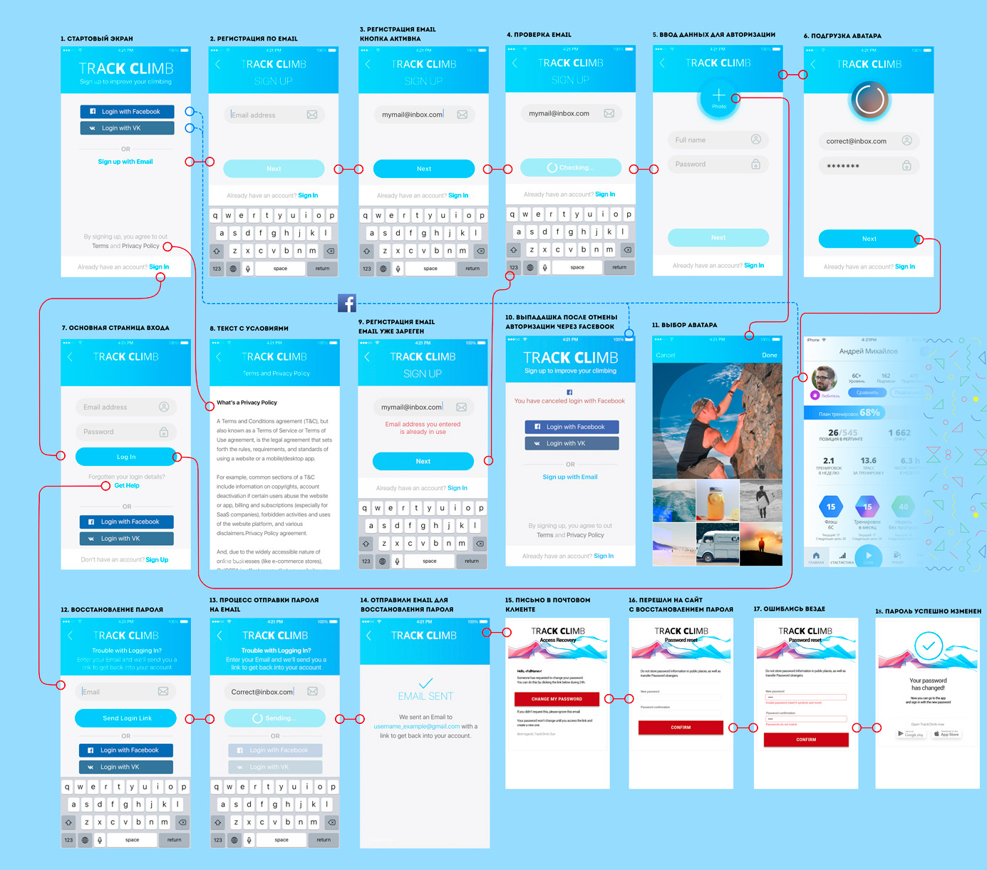
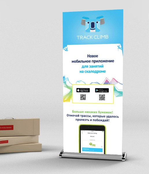
Firstly, our team decided to run MVP version for two Top Moscow Climbing walls. It’s necessary for check business model and UX. We found out, what a lot of Climbers afraid what in this application it’s necessary to pay. It’s not true, and we added special «free» label in App Store, Google Play and on print advertising material. That helped us to change numbers of downloads. This was our first big public A/B test, we get excellent information about UX of our target group.
Cause I have a lot of experience in marketing and pre-printing, we used quite a special kind of paper and ink for our marketing materials. It was an excellent experience, many participants of this festival downloaded our application without a special kind of Internet marketing and targeting.
We had to worry about QR-codes, as you know, this way of referencing is not common enough in Europe. But, this does not stop anyone from downloading the Qr-scanner, and people have done it.
After when we got to approve of our product, we changed a priority of features develop, and proceed to do what we have to.
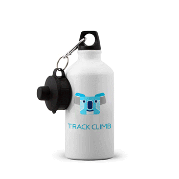
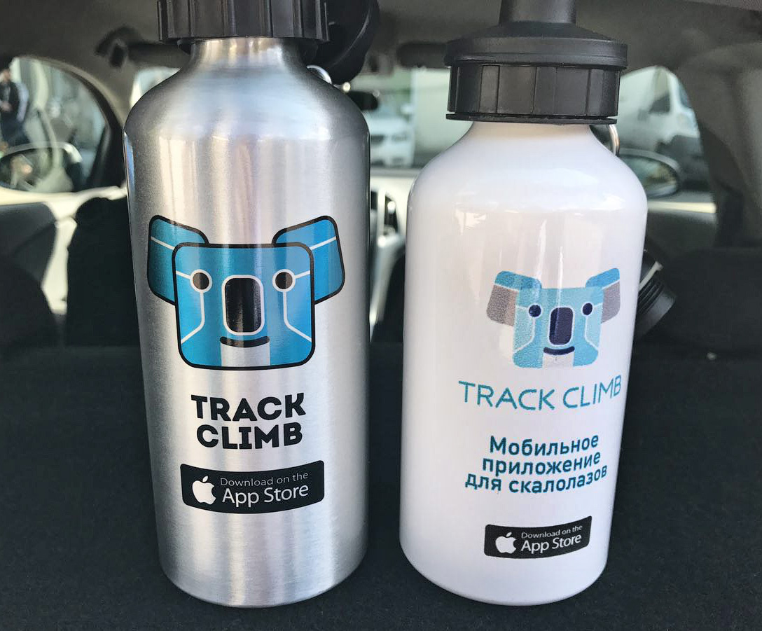
We created some special thermos with the TrackClimb logo. This was part of the gifts for the winners.
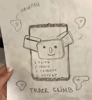
All of us got into a climbing area because choose the language your users are using. Choose clarity and be concise. We won’t sound like a system, we are all humans. And, of course, you know, what production-ready mockups and design for portfolio it’s different mockups. So, In the modern world in which we live, it’s necessary to show real design.
But you have to know: No design is ever finished or done. This mockup not about chase the ‘wow-effect’. Product design succeeds when it solves the problem or need of our users in the best possible way. Design the product effective & delightful. The reaction we are after from our users is “Of course, that is obvious”.
We understand what we need to Use Hypothesis Tests. Whether to show work to fellow climbers for feedback and see how users interact with interfaces during testing, we made a lot of prototype. We used a lot of tools for it: Origami, Framer, Marvel, Principle, Figma. More specifically, choose of the tools depends on what we trying to accomplish. When we need to make very complex prototypes and native interactions, we choose Origami. We used the “Goals-Signals-Metrics” method to determine our main metrics.

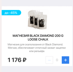
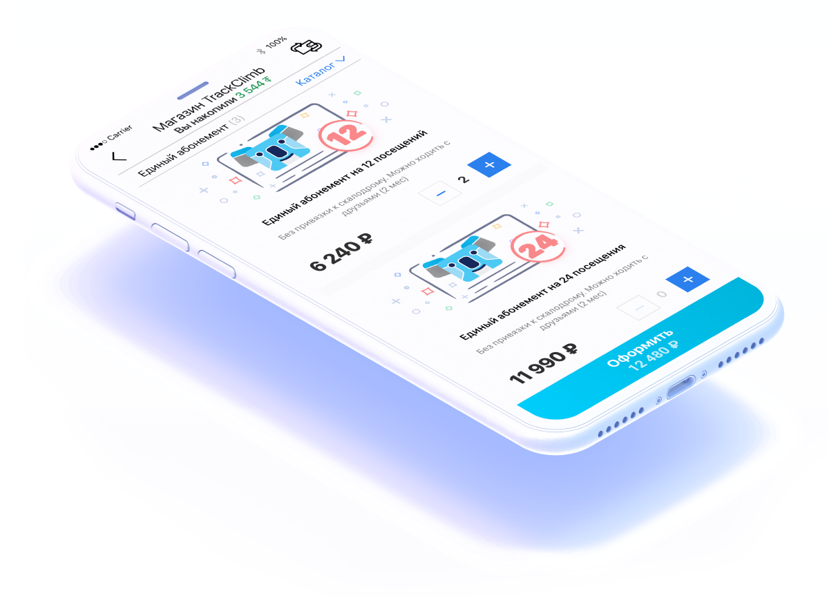
About the money. We went through many hypotheses, how we can start monetizing our application. Just imagine, we invented more than 100 hypothesis, tested a lot of them! Held many talks with shops, sports clubs, another businessman. Really hard work, Really hard work, it does not just draw a graphic design. As a result, we decided to make our personal e-shop. With special goods for climbers and flexible system of the discount. So, if climber checked all his routes in our application, he will get special bonuses – TraclCoins. One TrackCoin equal to one Rouble (about 4 cents). A climber can use this bonuses to pay off part of goods total price. A good idea! E-commerce is a good way to make a living. We had few main questions: how to organize the delivery of goods, how to choose best goods, and how to explain to climbers our system of bonuses.
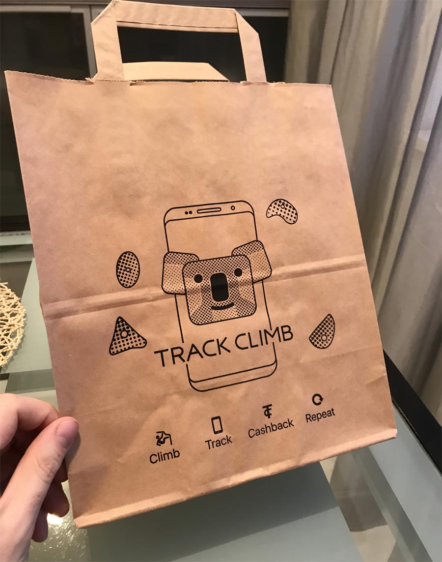
About delivery: all our customers its climbers, and we decided what organize delivery only to climbing walls it’s a good idea. So, it’s enough easy way, and people can order something like magnesia and get it when they need it — at climbing wall. If you are a climber, it’s absolutely best way to buy thinks сonsumables. Next question it’s where we will hold goods in climbing wall until customer will take away it? For any climbing wall, we invented a personal way. In one we used special pick point safe. Another climbing wall just holds all orders at special places at a reception. Also, we created a special pack with our logo for hand out orders.

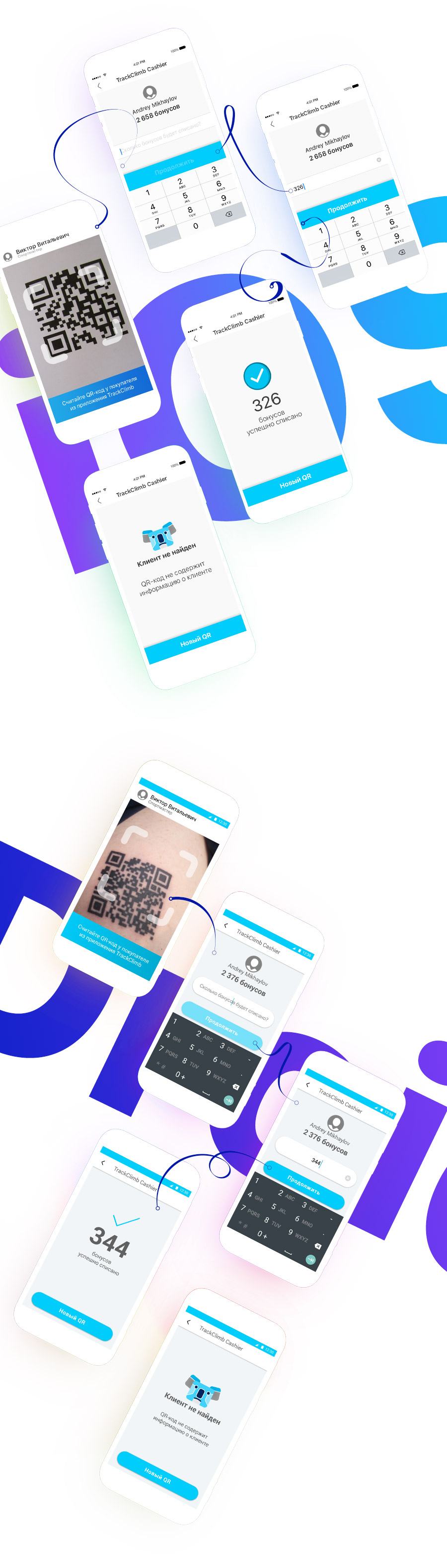
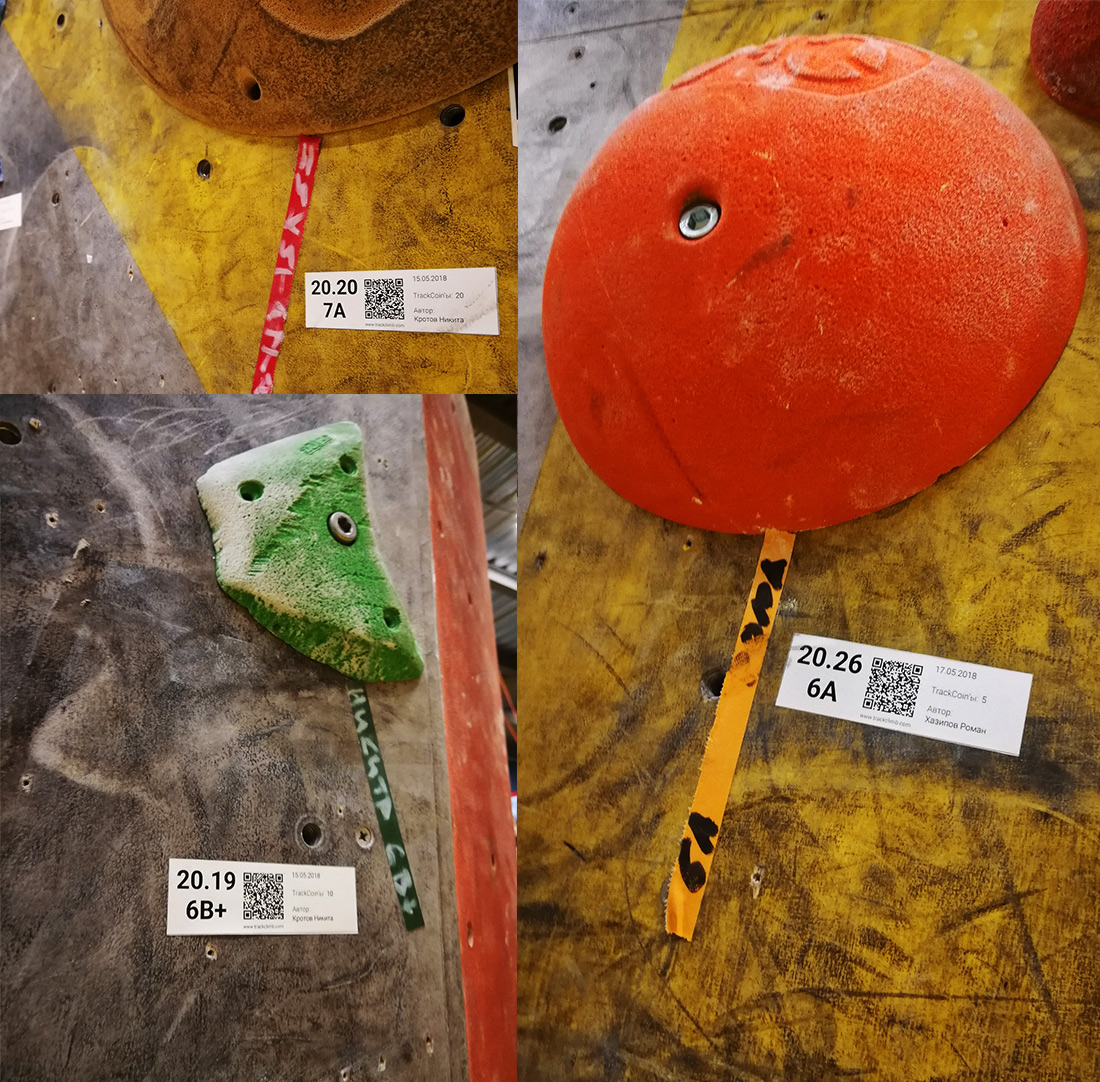
For what we used QR?
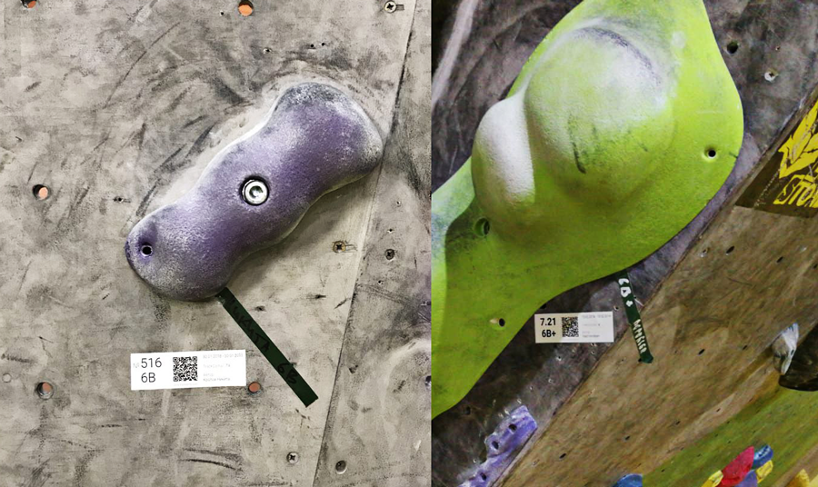
We want to improve processes in sports climbing area. In climbing walls often happens competitions. Usually, organizers just keep all achievements of sportsman’s on special board or stickers. It’s inconvenient and it’s not very easy to save and keep all results. We improved it this way: near every rout is necessary to stick special paper with QR code. Sportsman just catches this code by our mobile application and this rout will be taken into account. So, as result, we can keep all data about sportsman and make statistics, ratings and sum up. Without mistakes and without climbing wall’s employees.
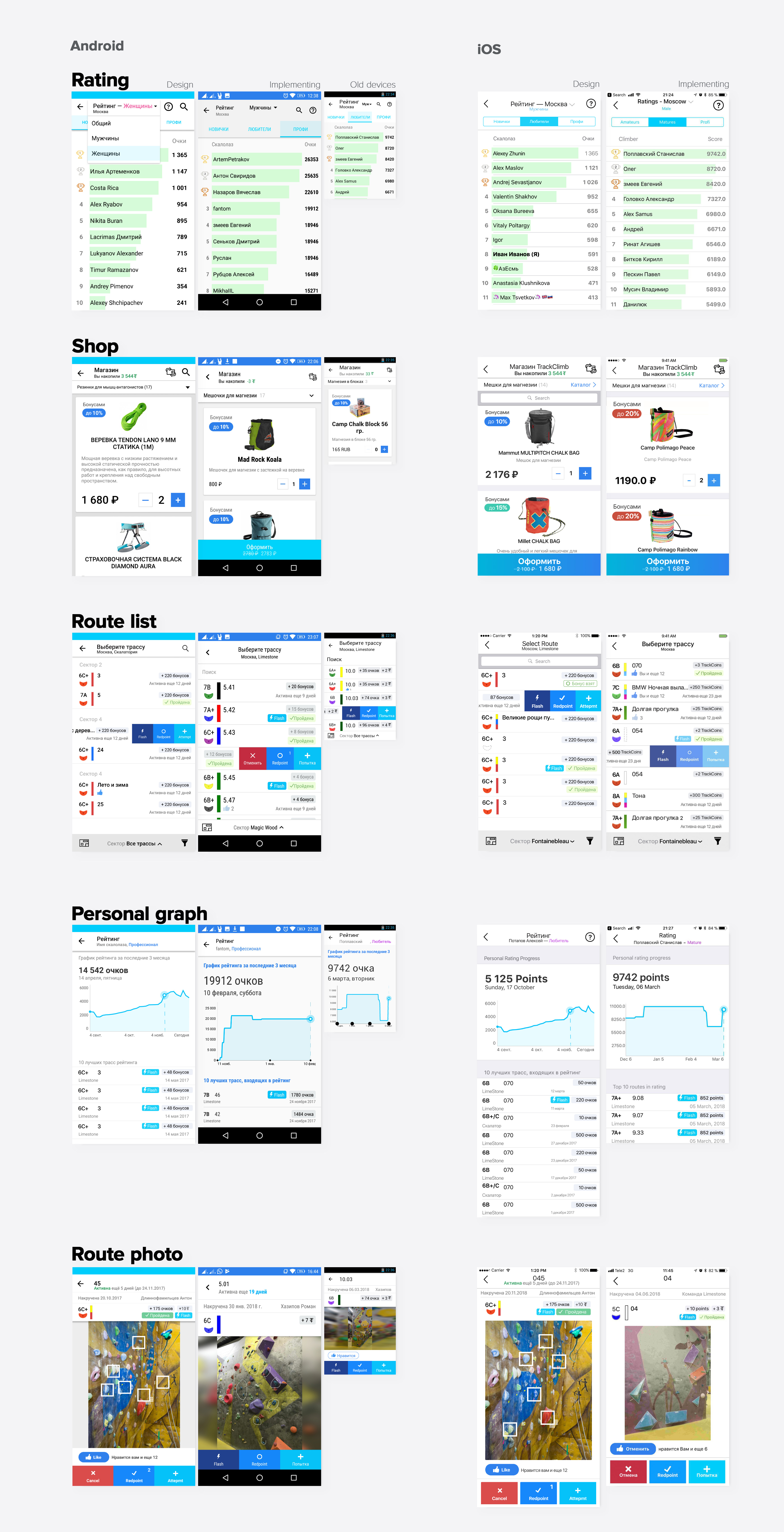
Everybody knows, design mockups and how it turned out in real application — its different product. There are few examples of mockups and realization in iOS and Android. You can see, we last to design during all process, from idea to existing working software product. The main reasons for the changes our team received from interviews with our users. Every new idea went through a lot of climbers and only after this we made decisions to change real applications.
After 1.5 years, most parts of the climbers’ gyms of Russia and Ukraine began to write to us about adding their gyms to our mobile application and to the marketplace. In all climb competitions, our TrackClimb application has become a standardized way of collecting results for each athlete. And we are faced with the problem of how to divide the various gyms in different cities with different goods and customers. Since we already have a legacy of user experience and we do not want to broke user habits, we have tested many cases of how to separate all this stuff. In the user interface, we found an easy way to solve this problem. We went through more than 100 different design options and just used the screen to select the gyms. Easily. In the business process, we created special guides for some gyms, where it was necessary. All problems had eliminate through individual work with this gym.
And fail.
It was a good story. But two years later we realized that there is not enough money in the industry for the product development in the market we have chosen. We got into the accelerator for business, together with very smart people we analyzed all the possibilities and decided just support our product, not to develop it any further. Yes, we screwed up, especially me as a product designer. But I have learned a lot during this path, more than many product managers can learn in 10 years of trainings.