ViPNet Connect
ViPNet is a big ecosystem with hundreds of different services. Each service needs to have a great interface understandable to common users.
Reassessment of its own skills, the lack of competencies in mobile development in-house designers, underestimating the time and budgets, lack of iterative. And many other problems that do not allow the “monsters” of the Russian market to independently develop high-quality enterprise applications. But all the same, problems exist in the development of packaged solutions. Below I will tell a little story as I could pull a few products to a new level. The cross-platform instant messenger with audio/video calls. An interesting feature: the inability to add a contact. The chat is already included all the necessary contacts, depending on the level of access the employee.
We were one of the first team in the world, which used quantum encryption technology. Therefore, good design was not the only significant plus of our product. About technology ru and eng.
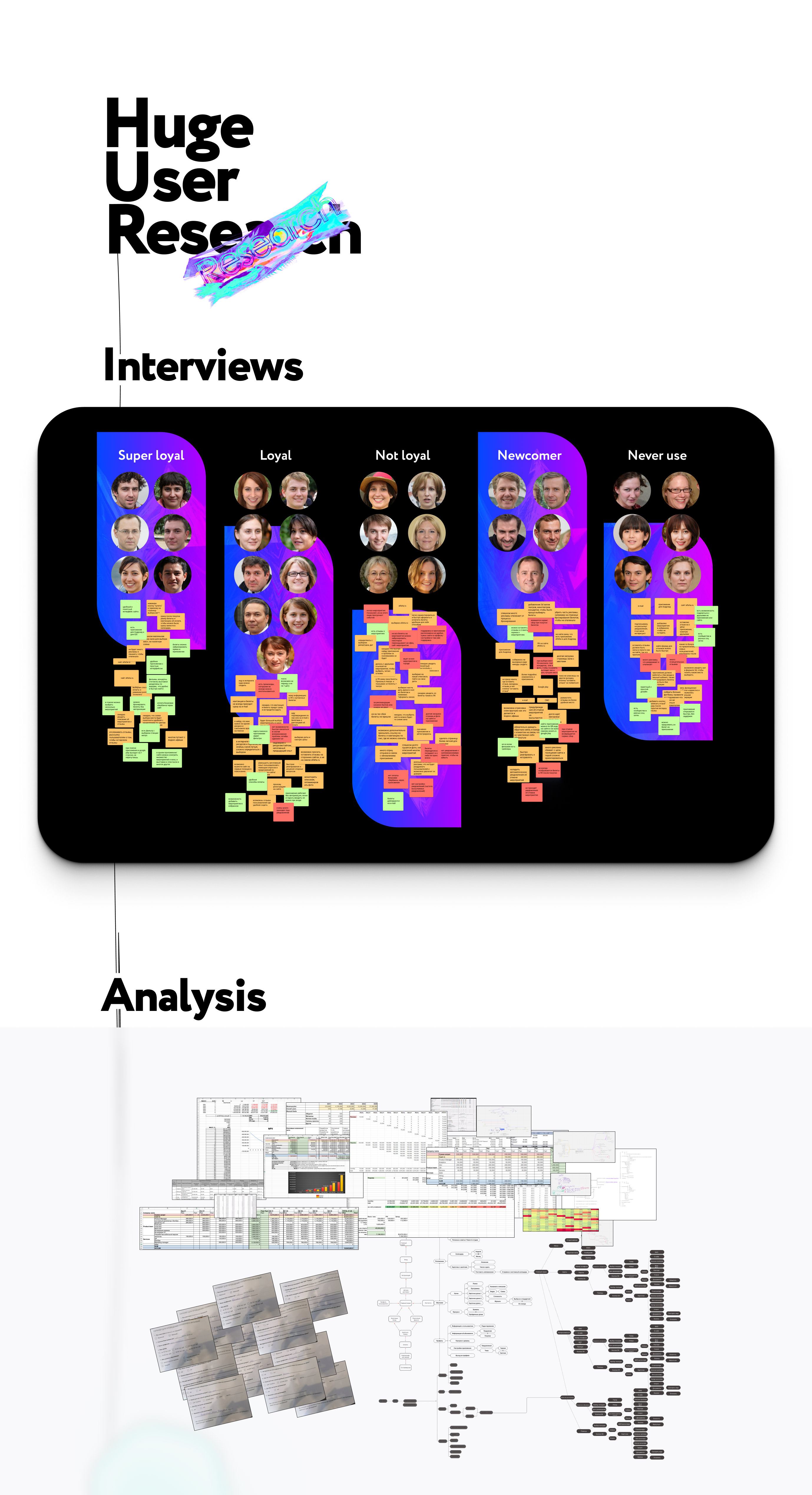
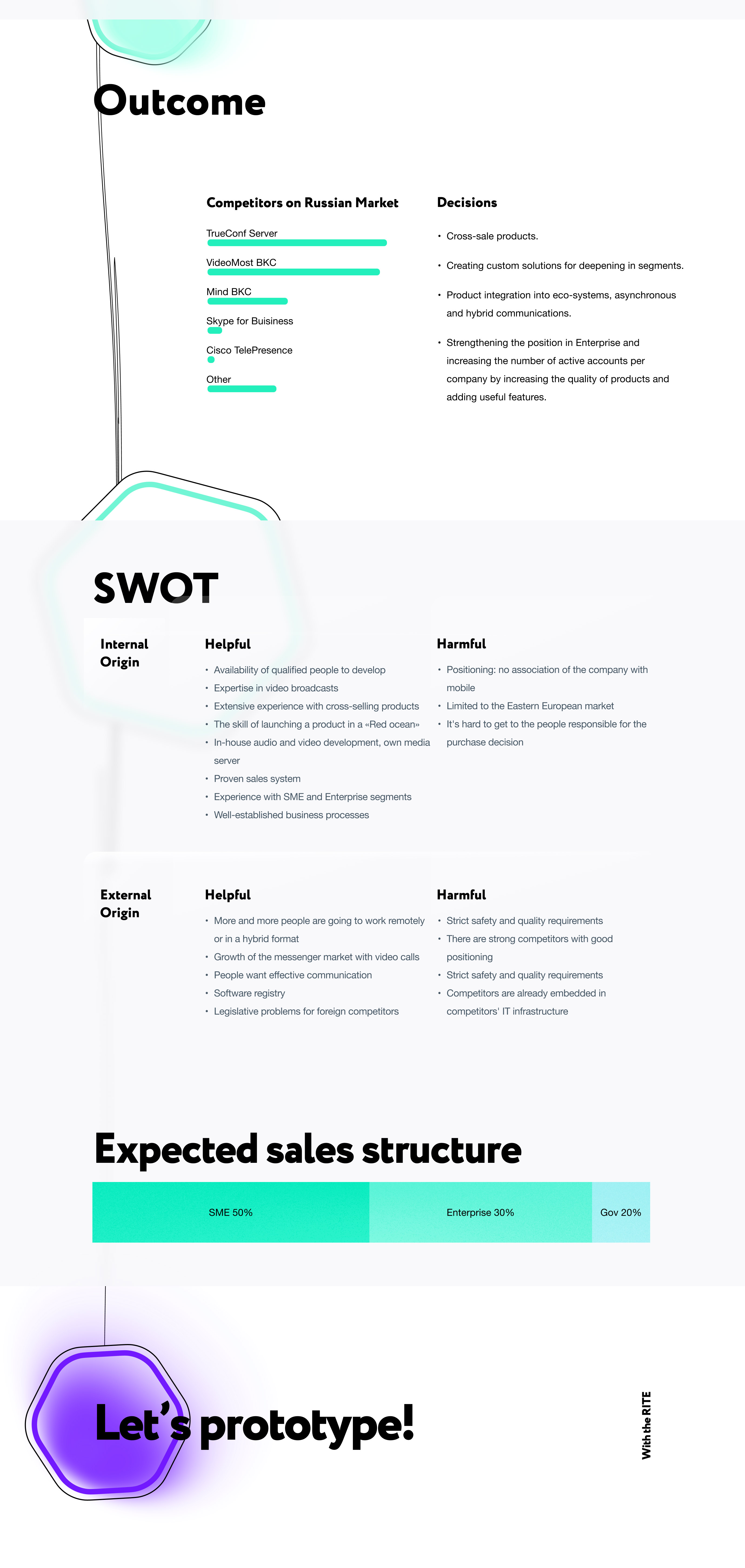
Windows/OS X
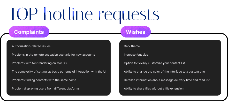

Key findings after desktop’s version:
- Starting to design a concept from scratch is always difficult and it can feel chaotic in the start.
- Building in atomic design principles and using elements pays off in the end especially when you have to redesign parts of your app along with creating new concepts.
- Bravely killing features that you previously done and are redundant now, is always a sane thing to do and sometimes feels therapeutic.
- Building fast on High fidelity mockups and making a working prototype with only image screens pays off because you use less resources (no development time spent on this).
- Redesigning an app and having to think outside the box leaving away your own bias for the app you spend months building can be a challenge on its own.
Let’s go for iOS

We used for smile emojione
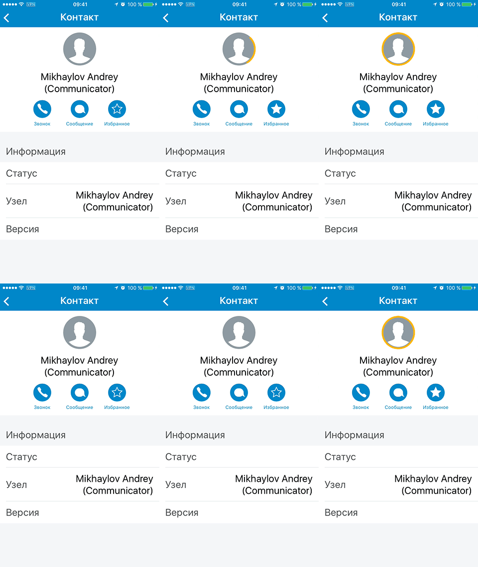
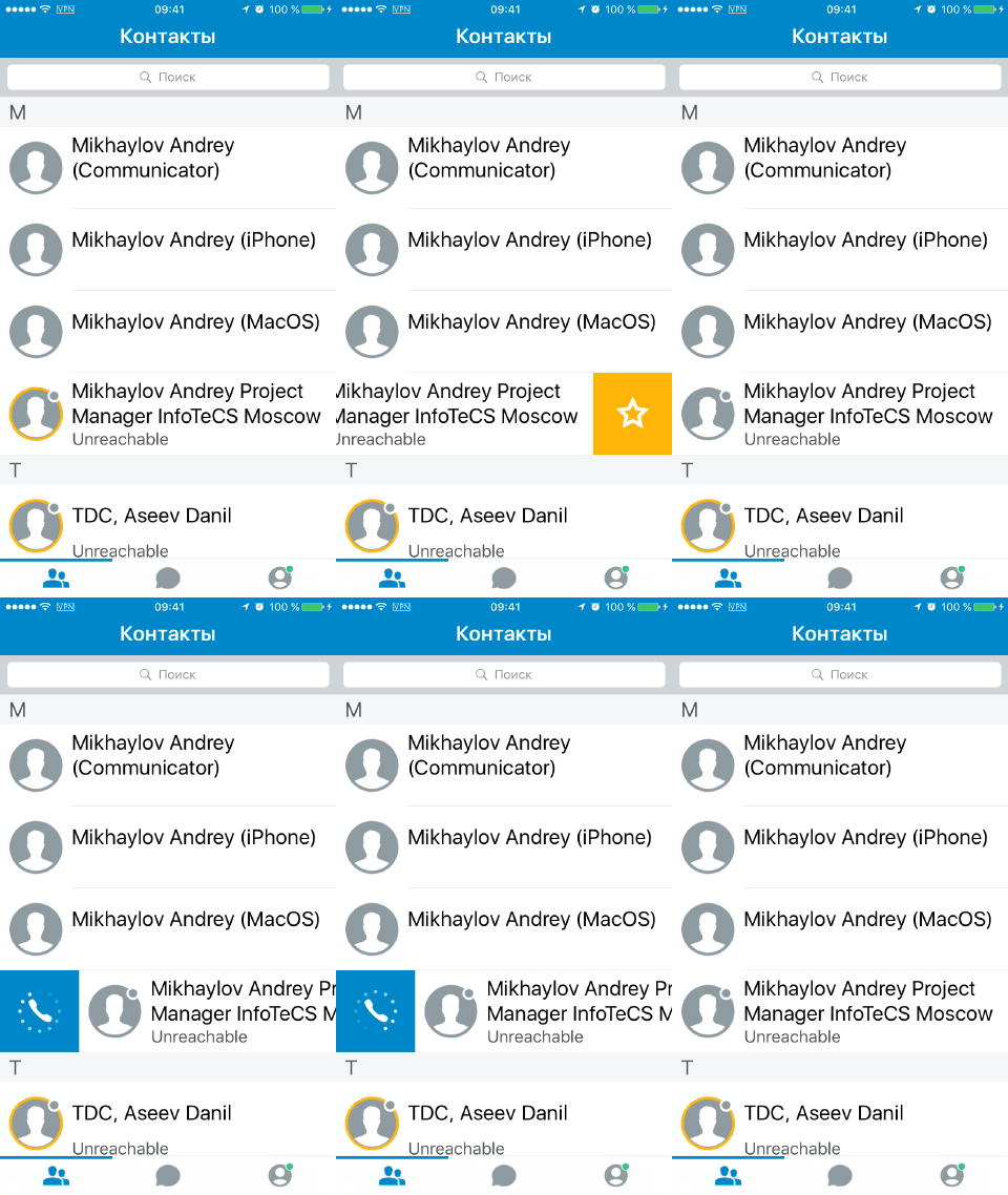
Add to Favorite animation
Motion effect (like iMessage), and also show / hide the time and status indicator during scrolling. And change the color of the bubbles to scroll.
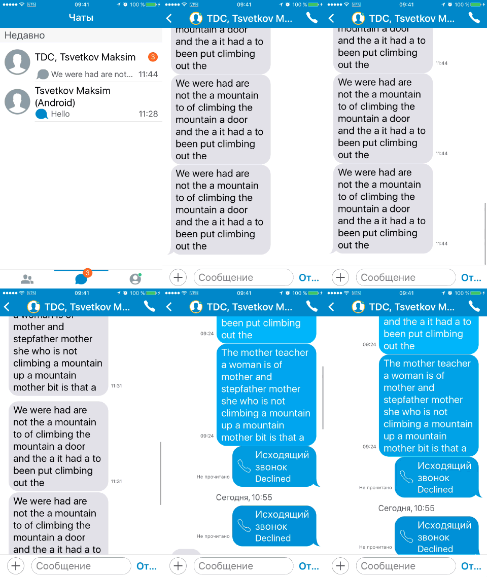
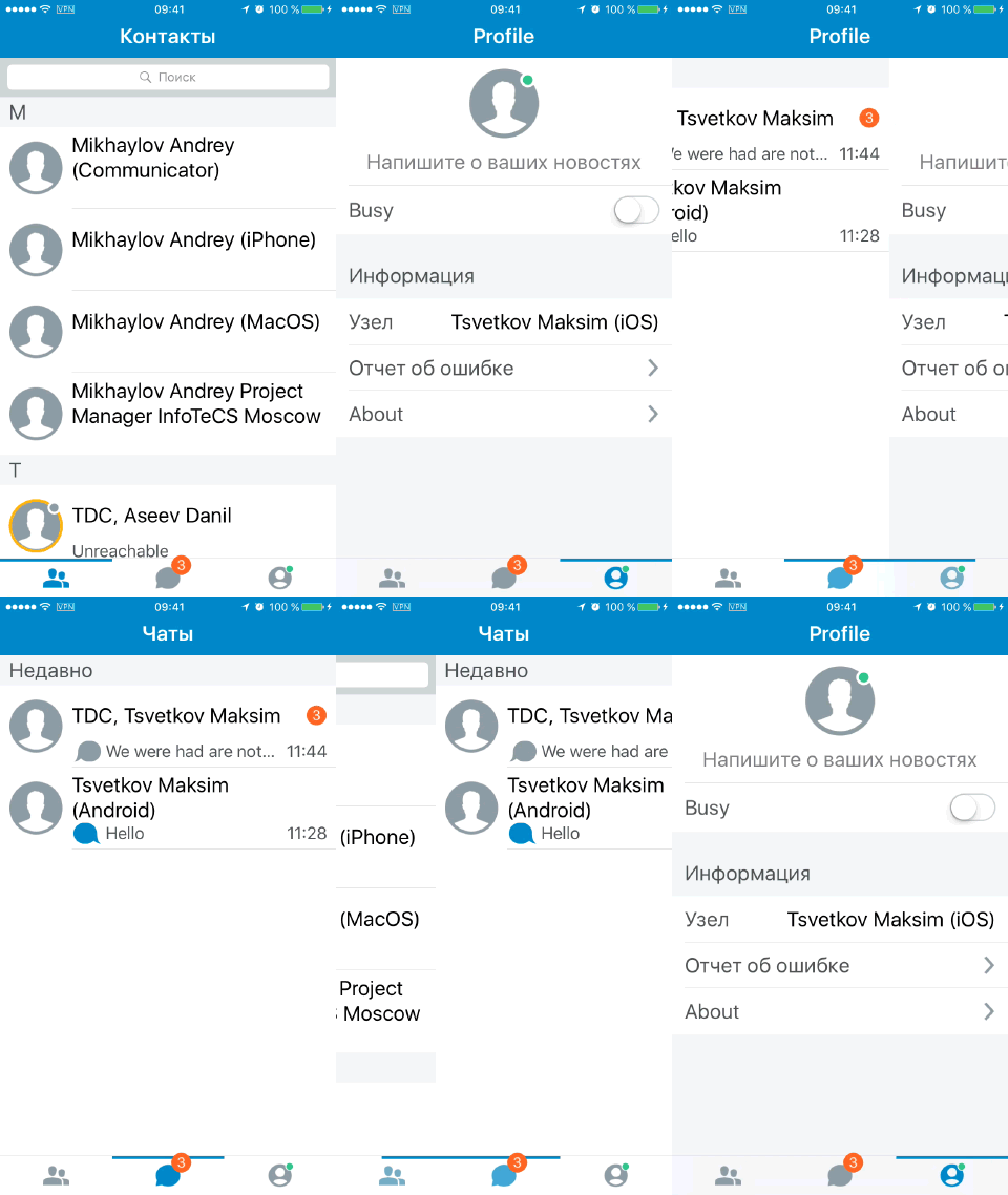
Swipe for Tabbar. Animates the transition between three Tabs. And it’s just Wow!
Add to favorite in list of the contacts
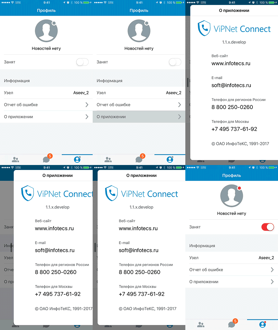
About. I decided to make this screen like popover.


Of course, we made a lot of user flow map. For example, it is user flow for group chat:

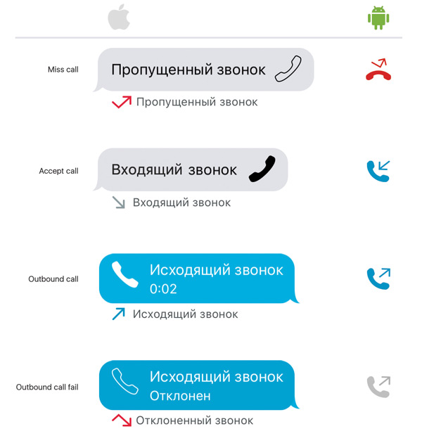
Icons Call status for different platforms has a different design, because the principles and ideology of ios and android are very deep and have fundamental differences in many ways.
Very soon, my ViPNet Connect app, an enterprise communications application for secure voice communications and secure transmission of text messages and attachments, was named the best secure remote communications solution for local market.
